Monday, November 22, 2010

Analyzing My Portfolio Website

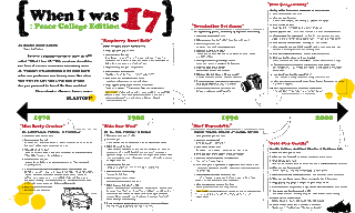
Based on the book [Don't Make Me Think] written by Steve Krug, these
are some of the analyzations I made on my portfolio website:

- Although I am still in process of writing a good description, my
homepage will eventually contain a short description of what my
website will serve as to its viewers. The three goals I have for my
viewers are to have them look at my portfolio pieces, as well as my
resume, and possibly contact me for my work. To reach these goals,
Krug says "know the main things that people want to do on your site
and make them obvious and easy."

- Krug also says that it is important to lead people directly to where
they want to. To meet this criteria, I have directly linked my
navigations to what the viewers might want to see, whether that would
be an identity piece or photographies.

- According to Krug, putting effort to the website is also important.
To show my skills, I have created a homepage that is fun and partially
interactive. Since this is a portfolio website which I am creating to show
off my works and skills, my homepage serves as showing what I can do.

- After the viewer finishes looking at my portfolio pieces, it is possible
that they might want to see my resume and contact me. For this reason,
my resume and contact information are always available on every page
of my website.

Some of the goals that I've tried to reach were, to create a fun and
interesting website that is clean and effective in emphasizing my work.

Wednesday, November 3, 2010

Portfolio site sketches

These are some of my rough ideas on my portfolio site.
They are based on symmetrical balance, asymmetrical balance, and the rule of thirds.

Monday, November 1, 2010

n2n_rough idea

Here is another design for n2n after our first critique with the client.

The blank triangular space is where the pictures will be,
which I have not quite figured out how, yet...

(front and back)

Tuesday, October 19, 2010

variation of n2n design

This is another variation of n2n design.


Senior Seminar: n2n

I am currently working on an advertisement packet for a
non-profit organization called neighbor to neighbor (n2n).
n2n is an organization which provides after school learning
experience to children in the community through mentoring system.
In order to encourage college students to become mentors,
n2n needed something that they can hand out at college volunteer fairs.
Here are some of my progress on this project:

The first version is my initial design for this project, which I added
a third color and a lighter green to n2n's original colors
(dark green, orange and white). The second version is with same
design, but in different colors. The second version is mostly with
n2n's original colors, just in case that is what they prefer.


Monday, October 18, 2010

Rollover Images

This will be my rollover image for the navigation menu.
Since I already have enough images, I didn't wanted to add
a new image, so I just made the background of it darker
and changed the text to white. Hopefully this will work-

Wednesday, October 13, 2010

2nd Issue of The Peace Times

Below is the full page spread that I worked on for the 2nd Issue of The Peace Times. The article is about when faculty and staff members were 17- This was the first time I've ever worked on the graphic of a newspaper article, and although challenging, it was fun to work with- I've also tried to get away from my usual style of using soft colors so I'm kind of happy with its boldness :]

Monday, October 11, 2010

1st Issue of The Peace Times

This year, I've become a part of the newspaper team-
I'd say I'm enjoying it very much
and it's stress-free for the most time!
Here are two projects that I worked on for the first issue.

This is a calendar with campus events information on it,


and this is an ad. for Person Street Pharmacy.
It was interesting to design for them because of their uniqueness
of selling both medicines and hamburgers...

Updated homepage and templates

In the order of home-> about -> training -> resources


Sunday, October 3, 2010

Web Re-design sketches

As part of our new assignment in Design for Screen, we are re-designing the current websites according to our partner's
(or "client's") need. The topic that I am given with is "medieval martial arts" and here is the website that I'm re-designing: http://www.aemma.org/
I will explain more about the process as we go along, but for now these are my sketches.

Monday, September 20, 2010

Portfolio Inspirations

Hello! I've just realized that my last post was on April (wow).
Between now and then, a long summer has passed and
I've become a senior in college, which means it's time to get
ready for the real world! (the fun stuff! I want to look at it as..)
The first step I'm taking is prepare my portfolio and
making sure it looks as perfect and professional as possible.
Since my portfolio is a reflection of who I am as a designer
it is important to organized it in a way which it will leave
a good impression on the viewer. Speaking of impression,
often times first impression can almost determine
something's overall impression. In other words, first impression,
or the moment you step into the interview room should
not be underestimated. In order to stand out from the beginning
of the portfolio review, we have learned in class that
having a portfolio bag/case/box that's unique is critical.
So I've done some research and listed some of the portfolio
containers that would inspire me on finding the right one for me.

custom made portfolio case 1

custom made portfolio case 2

digital portfolio case

aluminum portfolio case

Tuesday, April 27, 2010

Introducing "Eggie"!

Today, (instead of working on my project)
I randomly came up with these characters,
and while I was drawing them, Morgan, my friend asked me
if it was a some kind of "Eggie"!
I was quite surprised and wondered if Morgan
secretly knew how to speak Korean,
since Eggie, (or Aaggie) is a word used to call babies in Korean!
Of course, she meant that they looked like eggs
but why not name them "Eggie" since it perfectly fits the character :)


(Click to see a larger view)

Wednesday, April 21, 2010

101 Things Designers Can do to save the Earth

With the interest of going "Green" constantly growing
at every corner of the world,I was searching for how designers can
support it and found this cool web page that lists 101 things
(and more!) we can do as a designer.
Although not all of them may specifically apply to graphic design,
there are some cool tips on how you can think
in a new way while being earth-friendly.


here's the link

Monday, April 12, 2010

Postcard design final

These are my final 12 postcards that I designed for my Imaging class. I was to design each postcard according to the 12 random words that were given. Also, out of 12 postcards, half of them had to denotative and the other had to be connotative. Along with that, 4 of them had to be montage, collage and patterns. We did not had to have a specific theme for this project but I decided to have one to give my postcards a sense of unity. This year marks the 40th anniversary of celebrating the Earth day, and I thought this would be a perfect theme for my project since it'll allow me to design something that's creative while containing a meaningful message.


Thursday, April 8, 2010

Cool websites of the day :)

1) The Dieline
(I'm not sure if there should be a space between die and line;)
This is a website that contains bunch of amazing packaging designs

2) Plushism
This is more like arts & crafts, but
this lady makes her own camera, cell phone, card cases
and they're super cute-

Monday, April 5, 2010

Tutorial9_Adv.GD : Glowing Type


For me, this is the coolest tutorial so far.
It was easy to follow yet had many tricks to learn-
Dealing with so many layers seemed like a challenge
but the tutorial also showed me some tips on how to manage them.

Here's the link!

Wednesday, March 31, 2010

Cool Website

Here's a website that I found which sells wall stickers.
Check out some of the different designs they have-!

Tuesday, March 30, 2010

Tutorial8_Adv.GD : Metal Type

This tutorial taught me how to create a 3D effects by using multiple layers
and also how to distort type to make it look like it's lying down.

Here's the link

Thursday, March 25, 2010