Monday, November 22, 2010

Analyzing My Portfolio Website

Based on the book [Don't Make Me Think] written by Steve Krug, these
are some of the analyzations I made on my portfolio website:

- Although I am still in process of writing a good description, my
homepage will eventually contain a short description of what my
website will serve as to its viewers. The three goals I have for my
viewers are to have them look at my portfolio pieces, as well as my
resume, and possibly contact me for my work. To reach these goals,
Krug says "know the main things that people want to do on your site
and make them obvious and easy."

- Krug also says that it is important to lead people directly to where
they want to. To meet this criteria, I have directly linked my
navigations to what the viewers might want to see, whether that would
be an identity piece or photographies.

- According to Krug, putting effort to the website is also important.
To show my skills, I have created a homepage that is fun and partially
interactive. Since this is a portfolio website which I am creating to show
off my works and skills, my homepage serves as showing what I can do.

- After the viewer finishes looking at my portfolio pieces, it is possible
that they might want to see my resume and contact me. For this reason,
my resume and contact information are always available on every page
of my website.

Some of the goals that I've tried to reach were, to create a fun and
interesting website that is clean and effective in emphasizing my work.

Wednesday, November 3, 2010

Portfolio site sketches

These are some of my rough ideas on my portfolio site.
They are based on symmetrical balance, asymmetrical balance, and the rule of thirds.

Monday, November 1, 2010

n2n_rough idea

Here is another design for n2n after our first critique with the client.

The blank triangular space is where the pictures will be,
which I have not quite figured out how, yet...

(front and back)

Tuesday, October 19, 2010

variation of n2n design

This is another variation of n2n design.


Senior Seminar: n2n

I am currently working on an advertisement packet for a
non-profit organization called neighbor to neighbor (n2n).
n2n is an organization which provides after school learning
experience to children in the community through mentoring system.
In order to encourage college students to become mentors,
n2n needed something that they can hand out at college volunteer fairs.
Here are some of my progress on this project:

The first version is my initial design for this project, which I added
a third color and a lighter green to n2n's original colors
(dark green, orange and white). The second version is with same
design, but in different colors. The second version is mostly with
n2n's original colors, just in case that is what they prefer.


Monday, October 18, 2010

Rollover Images

This will be my rollover image for the navigation menu.
Since I already have enough images, I didn't wanted to add
a new image, so I just made the background of it darker
and changed the text to white. Hopefully this will work-

Wednesday, October 13, 2010

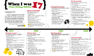
2nd Issue of The Peace Times

Below is the full page spread that I worked on for the 2nd Issue of The Peace Times. The article is about when faculty and staff members were 17- This was the first time I've ever worked on the graphic of a newspaper article, and although challenging, it was fun to work with- I've also tried to get away from my usual style of using soft colors so I'm kind of happy with its boldness :]